Corporate Logo & Mascot
The Sprout as a Symbol for Our Corporate Logo

1986 marked the 15th anniversary of our foundation. With the goal of becoming a comprehensive company that produces not only sushi but also onigiri and lunch boxes, we changed our name from Shinobu Sushi Co., Ltd. to Shinobu Foods Co., Ltd. and redesigned our corporate logo.
The Shinobu Foods corporate logo, created then and used to this day, represents a sprout. It embodies the idea that the source of Shinobu Foods' corporate activities is the sprouting of rice, and that as a company with a global standpoint, we constantly need new "sprouts" in our corporate activities.
The elements that produce sprouts are the sun and water. The logo consists of three elements: a rising sun, flowing water, and a sprout. The overall shape forms a human figure, representing cooperation and solidarity.
The red of the logo symbolizes new growth and warm communication between people.

-
The Shinobu Foods Mascot
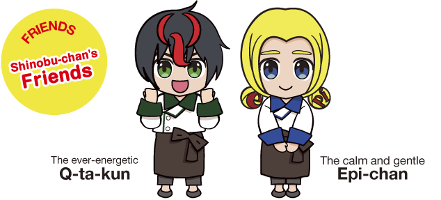
Shinobu-chanIn addition to the beloved Shinobu-chan, our mascot from the first to the fourth-generation of the company, adorable new mascots with lively expressions and movements have debuted to commemorate our 50th anniversary.
They appear in a variety of media including our websites, pamphlets, and posters. Please show them some love!
The History of Shinobu-chan
Do you know Shinobu-chan's origin story?
Many believe her face was modeled after the founder's second daughter. But this is not the case. Shinobu-chan was actually drawn based on a popular celebrity at the time. Since then, her design has changed at key company milestones such as when the company went public and during mergers, bringing her to her current form. Characteristics include her adorable smile and her famous pose with her right hand next to her face.
-

1st-Generation Shinobu-chan
The first-generation Shinobu-chan first appeared on product packages and catalogs of Shinobu Sushi, the predecessor of Shinobu Foods. Her adorable smile and pose with her right hand to her face have remained unchanged. The Shinobu-chan of this era had dimples.
-

2nd-Generation Shinobu-chan
The somewhat more childlike second-generation Shinobu-chan made her TV commercial debut in 1971. She also appeared on many billboards in Osaka.
-

3rd-Generation Shinobu-chan
Shinobu-chan's design changed slightly once again in 1994, when we merged with Big Foods. From this year onward, she was often pictured together in designs with Big Foods characters.
-

4th-Generation Shinobu-chan
The fourth-generation Shinobu-chan underwent a major transformation from her somewhat old-fashioned image. Shinobu-chan is engraved on the left arm of the white coats worn in plants and continues to watch over the lunch boxes and onigiri made with love and shipped out each day.
-
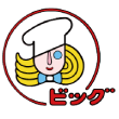
Kansai Lunch Cook
A cook who was created in 1977 as the mascot for Kansai Lunch, the predecessor of Big Foods, who was pictured next to Shinobu-chan for a while starting in 1994.
-
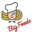
Big Foods Cook
The mascot was redesigned when the company name was changed to Big Foods in 1993, and after Shinobu Foods and Big Foods merged the following year in 1994, the fourth-generation Shinobu-chan and Big Foods Cook stood together as friends for a time.
-
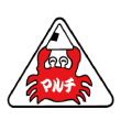
Maruchi Crab
The mascot for Maruchi, which joined Shinobu Foods in 1992, was a crab. It was created based on the mascot of a company that helped the founder of Maruchi when founding the company.
-
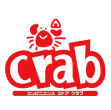
Delica Kitchen Crab
In April 1994, the beloved crab character was redesigned along with the changing of the company name to Delica Kitchen Co., Ltd.
